Constructed Landscapes
If I had to describe my relationship with the natural world I would probably describe it as limited, I don't really spend much time in and around nature unless I'm outside for sports. Although I don't spend much time in nature, landscapes are one of my favourite things to photograph. I believe that photography can change the way a person sees things as it can allow a person to see something from the perspective of somebody else whose views and opinions may differ from their own opening their eyes to a different way of seeing things which may be more difficult to express through words than an image .

Roger Fenton - The Valley Of The Shadow Of Death, 1855
The Photographer seems to have chosen to photograph what seems to be an empty desert and excluded the presence of any people. When looking at this photo I would assume that the relationship between the landscape and the photographer may be seen as quite a close one as the photographer is in a place where no other people are in sight, it may be somewhere that Fenton went for comfort or somewhere that meant some thing to him. The image seems to have been taken from a low vantage point as the image seems to be at a slight angle. It feels as if the image is taken from within the landscape rather than from far away and of it.

Richard Prince - Untitled (Cowboy), 1989
It seems as if the artist has chosen to photograph the view of a sky and while doing this a cowboy has rode past on his horse, whether this was intentional or unplanned I'm unsure. The image seems to be taken from quite a level vantage point as it seems to me that the subject is on the same level as the photographer. I do feel like the image seems to be quite close up but it seems to me as if the image has been zoomed in rather than actually taken from that close up due to the pixilation of the image this may also be due to the fact that the photo is relatively old.
Here we where tasked to purposefully take bad photos and to ignore the tips we discussed at the beginning of the lesson
Here are the results:
Here are the results:


At first It felt very uncomfortable to take pictures in this way as I had to completely ignore all the basic rules of photography and how to take a good photo but as the process went on it began to fell easier to take the photos in this way, although it never felt fully comfortable, even now looking back to the photos once they've been taken off the camera and uploaded it still looks and feels wrong.
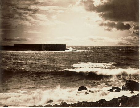
Gustave Le Gray - The Great Wave, 1857. Albumen print from collodion-on-glass negative.
|

Dafna Talmor - From the Constructed Landscapes II series. C-type prints made of collaged colour negatives
|
There are some basic similarities within the two images they have similar content as they both contain images of what looks to be a sea, another similarity is in the fact that they have minimal colour this is especially seen in the image on the left where there is no colour present. There are also a few differences between the two for example the image on the left may be seen as quite simple and dull whereas the image on the right might seem complex and abstract. Another noticeable difference Is that the photo on the left seems to be taken as a normal photo from a camera or something alike but the one on the right seems to be composed or constructed from possibly multiple images. A few words that can be used to describe the image on the left may include: Simple, Dull, Vintage, Contrasting, Organic, Lifeless and for the image on the right you might describe it as: Abstract, Constructed, Unique, Lifeless, Calm, Still. If I had to chose out of the two I would probably decide to live at the location of the image on the right, this is because it seems more calm and still unlike the image on the left.
Dioone Lee's Constructed Landscapes
Drafts from Dionne Lee on Vimeo.
I enjoyed certain pieces of work throughout the video, I believe that the images being ripped and folded allowed the artist to use multiple images within one piece which made their work more interesting and unique than if it was just a standard image of a landscape. The artist made the art with a selection of images of certain landscapes which they then cut ripped and folded to produce the final piece. The work in the video relates to constructed landscapes was it has been created from several separate image and then put together to from one piece.This work is quite different from a conventional image of a landscape as it was made in a more unique way especially with all the images being changed by the artist with the use of rips and folds it further the uniqueness of the work as it would be difficult to replicate what had been dine whereas someone could quite easily replicate a standard image of a landscape.
My Response To "Dioone Lee's Drafts"


I used the photo response to develop my ideas before I started with the video as I didn't want to start the video process without a basic idea of what direction I wanted to go in with my response. All the images used in my response where images from around the classroom whether that be from ripping pages out of magazines or photocopying pictures from books. If I was to go back and do it again I would probably go further with the photo response to get more photos and eventually a final product which I didn't do as I moved onto completing the video response as I wanted to capture an idea I had on video before I had the time to forget it.
Uta Barth


Uta Barth is a 64 year old German-American photographer who's early work emerged in the late 1980s to the 1990s, In 1989 Barth's work was mainly in black and white. It is said that Uta Barth takes all her photos with a traditional film camera and gets the blurred effect we see in her photos by focusing her camera on an empty foreground. Her work mainly focuses on perception, optical illusion and non-place and she is well know for her use of blurry/out of focus images.
My Response


We where asked to take photographs of landscapes around us using our phone cameras out of focus, we achieved this by placing our finger in front of the camera and waiting for "AE/AF lock" to pop up at the top of the screen which allowed the photos to be taken out of focus. At first when asked to take images in this way I wasn't sure how it would turn out but as I got further in to the process I did begin to feel more comfortable with taking the photos out of focus and was happy with most of the images that I produced through the process. Most of the photos came out quite well in terms of focus with the images fully out of focus but there is one or two of them slightly clearer despite the "AE/AF lock" appearing before I took the photos. In terms of framing etc I would ,in certain images, try to remove some of the bottom out of the image to make the only thing in the image the landscape I was attempting to capture. This practical is related to constructed landscapes as we had to obscure the images giving the landscapes a different look to what they would have if they where taken as clear in focus images.

Choose your favourite image. Why did you choose the photograph?
I selected this photo out of all of them taken during this process as I personally enjoyed it the most I feel that it effectively responded to the prompt and came out as quite a nice image I enjoy how the image seems to be enclosed by the two buildings I also enjoy how the centre of the images is empty with only
I selected this photo out of all of them taken during this process as I personally enjoyed it the most I feel that it effectively responded to the prompt and came out as quite a nice image I enjoy how the image seems to be enclosed by the two buildings I also enjoy how the centre of the images is empty with only
Ray Metzker's 'Pictus Interruptus'


Ray Metzker was an American Photographer who first started his work with a 4x5-inch view camera and then moved on to work with a 35mm camera. It is said that Metzker titles and groups his images based on their location or technique. He was best known for his black and white cityscapes and for his large "Composites", collections of printed film strips and single frames. His work is now held in many public collections.

Out of the images above from Metzker's "Pictus Interruptas" collection I liked this one the most I feel like it takes a basic image and turns it into quite a advanced and complex looking photo by simply putting a piece of paper in the way in order to obscure the image slightly, I feel that the image being in black and white helps to deliver this effect.
My Response to Ray Metzker's "Pictus Interrupts"


We where given a task to create a response Ray Metzker's work, after the completion of this task there were only a few of the images above which I actually like but the process was quite enjoyable. I found that the images came out best when working from a higher vantage point which gave me more freedom within the framing etcetera as I had more options, and less wind. If I was to do the process again I would probably try and diversify the objects I used to obscure my images as I only used the a couple during my experimentation. This probably would've helped with the issue of the wind as I would have been able to use something else at the points where the wind was making it more difficult to use the paper. After returning to class and uploading the image I decided to make the response slightly more relevant to Ray Metzker's work by changing the images I took during the practical response into black & white.
I personally enjoy the look of the images in black and white more than when they are in colour as I feel like the black and white allows you to focus more on the techniques/items used to obscure the images although there are a few which I prefer the look of when they are in colour.
I personally enjoy the look of the images in black and white more than when they are in colour as I feel like the black and white allows you to focus more on the techniques/items used to obscure the images although there are a few which I prefer the look of when they are in colour.
Out of the images I took these 4 are my personal favourites, I chose them as I feel like the images look good and where the most accurate in terms of response to the work of Ray Metzker.
John Divola


John Divola is a 73 year old American contemporary visual artist who describes himself as "exploring the landscape by looking for the edge between the abstract and the specific".
- Between 1995 and 1998, John Divola made a series of photographs of isolated houses in the desert.
- Divola received awards as Individual Artist Fellowship from the National Endowment for the Arts in 1973, 1976, 1979, 1990 and a Guggenheim Fellowship in 1986.
- He published four books: Continuity, Isolated Houses, Dogs Chasing My Car In The Desert and Three Acts.
- Since 1975, His work has been featured in many solo exhibitions across the United States, Europe, Japan, Mexico and Australia.
- He has described being interested in the relationship between real artworks and representations of them, and the issues of the natural and the artificial.
- His work has a span of over 40 years and I said to have "consistently questioned the limits of photography"
Charles Wilkin


- Charles Wilkin is a collage artist
- He has said that he sees collage as something which replicates the collision of people, culture and emotion.
- He also say his "work is a loose collection of thoughts and observations in many ways and less about one specific theme"
My Response to Charles Wilkin
The image on the far left is a piece of work from Charles Wilkin which I used for inspiration for my responses (images to the right)

|

|

|
For my first response I choose to use an image I took while away in Madeira as the background. I then took another look at the work of Charles Wilkin and was inspired by his use of colour and pattern and tried to include aspects of that in my own piece when creating the collage. I then decided to reprint the same image in black and white and placed the collage on top of it to experiment with the look of it with a different colour for the background which finalised the piece for my response. I personally like the black and white version more as I feel it gives the colours in the collage more of a stand out effect making the piece more eye catching as you are drawn to the centre of the image.
Penelope Umbrico


Penelope Umbrico is a 65 year old American artist best known for her work in appropriating images that she finds online. I was initially drawn to her work due to its grid like layout and engaging colouring, I also personally enjoy sunset images and that was the first of her images I saw so it caught my attention quite easily.
Most of the images she uses in her pieces do not actually belong to her, she finds and takes them off of websites such as Flickr, which she used for her project 'Suns' where she found 541,795 pictures of sunsets, or eBay, where she got the images for her exhibition in 2010 & then names her work after the amount of results that show up after her searches eg. "541,795 Suns From Flickr" for her first instillation or "5,911,253 Suns From Flickr" for a piece following it.
Most of the images she uses in her pieces do not actually belong to her, she finds and takes them off of websites such as Flickr, which she used for her project 'Suns' where she found 541,795 pictures of sunsets, or eBay, where she got the images for her exhibition in 2010 & then names her work after the amount of results that show up after her searches eg. "541,795 Suns From Flickr" for her first instillation or "5,911,253 Suns From Flickr" for a piece following it.
Rachel Isabel Mukendi


Rachel Mukendi is a young black women who focuses on mixed media collages, exploring the black female experience and her own identity she says she creates her work "as a direct response to the lack of representation within the arts"
While talking about a specific piece titled 'if I were white, I would capture the world' she says that she created the body of work to question and challenge the narrative of beauty and whitewashing within the arts she then carries on to say that her work was based off of the work of John Stezaker, who's work she chose to appropriate, because she found his work fascinating but was also disturbed by it due to the lack of representation, she says "I didn't see images of Black men and women in Hollywood but they existed"
Examples of John Stezaker works:


My Response
For my final piece I have decided to take inspiration from both Penelope Umbrico & Rachel Mukendi but for different aspects of my response.
The inspiration for the actual photos will come from the work, and reasoning for the work, of Rachel Mukendi. I also want to try to, once the photos are taken, put them into a grid like layout as seen in the work of Penelope Umbrico.
The inspiration for the actual photos will come from the work, and reasoning for the work, of Rachel Mukendi. I also want to try to, once the photos are taken, put them into a grid like layout as seen in the work of Penelope Umbrico.
For this piece I wanted to use my images at a more personal level, my idea was to use images from the places I'm from, Madeira being the main one as I haven't yet visited the other two, to represent my background and where my family is from and to put that together with images taken here, I intend to do this with a few different photos to create a series of images.


The Photoshop Process


To attempt this process I was taught how to use photoshop in a new way to enable me to turn my idea into a final piece of work.
The steps included:
I repeated this 9 times in order to use a combination of all the photos.
The steps included:
- Selecting, and dragging, a image for the base into photoshop
- Then doing the same for a second image
- Adjusting the images so they are aligned
- Changing the opacity until the ideal look is achieved
- Then adding an effect to finalise the piece
I repeated this 9 times in order to use a combination of all the photos.


These are the results of the images I put through photoshop. The process enabled me to create a series of photos that I am mostly happy with in a way that was quite simple yet effective allowing me to turn my ideas into a piece of work. At first I was going to experiment with all the images but only select 3 to go on the website so none of the images, foreground or background, would be repeated but as I progressed I changed my mind because although the images do repeat, as each images appears 3 times, there are none that look identical so I uploaded them to show all of my images and therefore my full photoshop experience.


After I was happy with how the images looked I decided to try to experiment by adding some colour to the images my idea initial idea was to add the main colours of the Madeira flag, Yellow and blue, to the image i did this and then decided to try with other colours too. Overall i am quite happy with the results but do think i should have tried to do this with more than just the two images that are above.
For component 1 we explored the theme 'constructed landscapes', my first thought when I heard about the topic was...
as we went on I began to feel more comfortable with producing work to fit the theme. During the time we where. focusing on constructed landscapes I researched many artists in order to gain inspiration for different projects some of these artists include Dafnor Talmor, Dioone Lee, Uta Barth, Ray Metzker, John Divola, Charles Wilkin, Penelope Umbrico & Rachel Mukendi most of these artists where discovered through...
by studying the work of some of these artists I learnt...
We also did some work with threshold concepts...
Through out component 1 I experimented with a range of different techniques...
